


In initial discussions with Worksighted, they saw themselves as being only midway through their business goals, far from feeling content with past achievements.
Guided by this outlook, it helped build a creative vision that was characterised by journey's with the ups and downs and the twists and turns that businesses navigate all the time. It helped create a design language defined by dynamic lines and brand elements that traversed from one point to another, evoking progression and connections across timelines.




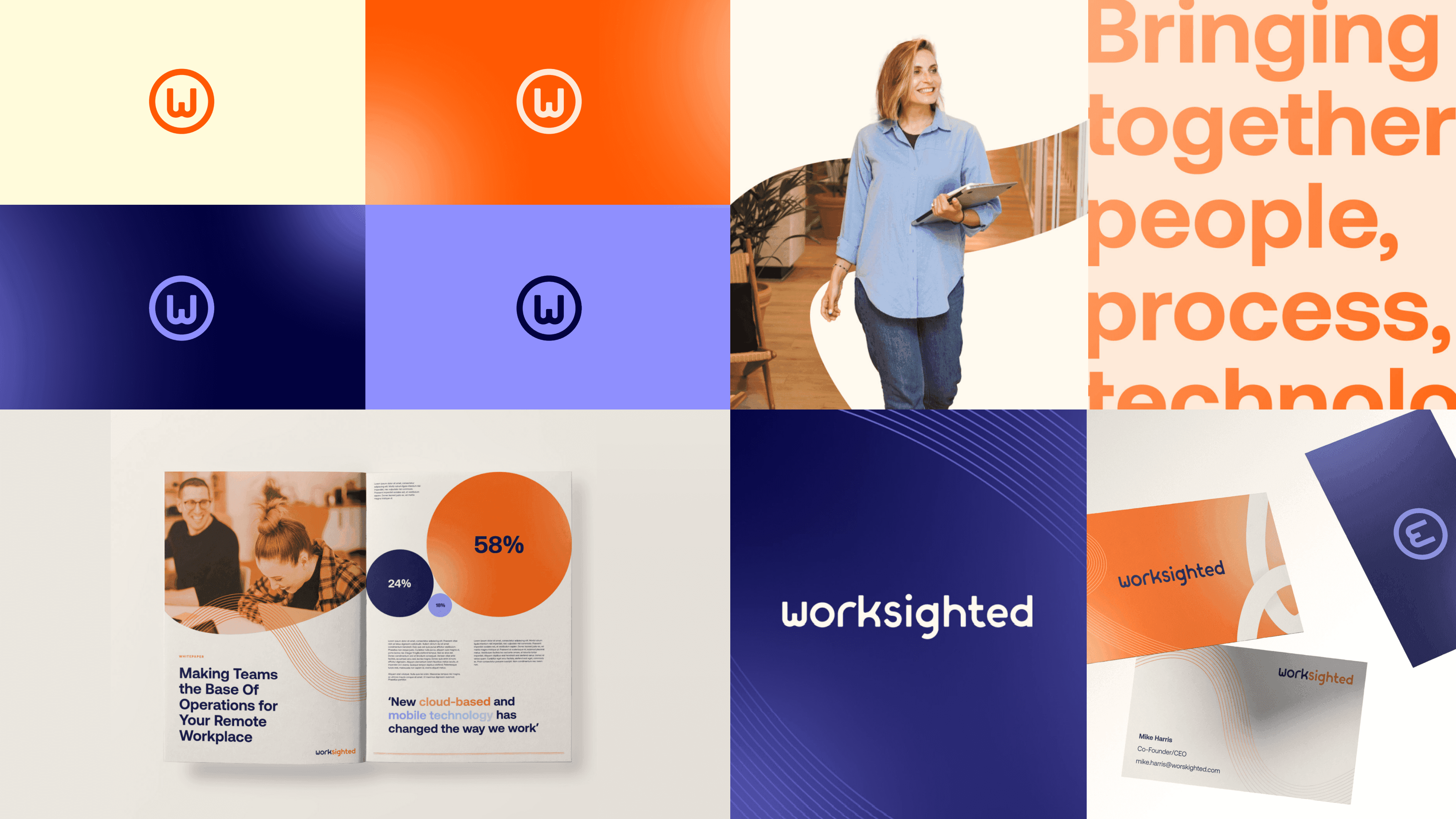
The logo was revamped, drawing inspiration from its predecessor to maintain a sense of familiarity. The brand icon received a makeover for quick and recognisable references.
The content team crafted a new value proposition and tone of voice, underpinned by the tagline 'People at the heart of technology'. Using Orange was a non-negotiable, and pairing that with a contrasting blue, the colours symbolised the dual essence of the tagline: People and Technology.
There were two distinct graphic devices following the journey theme, each with their own motion style. These elements provided versatility and distinction, enabling Worksighted to convey either a human-centric or technology-driven message with clarity and impact.


Part of the rebrand was to elevate Worksighted's website, ensuring their digital presence mirrored the recent update of the brand.
Guided by a client open to innovation, the designs defied the conventional norms of IT service companies. It aimed to captivate users and create excitement about the prospect of collaborating with Worksighted, incorporating elements that extended beyond the fold, enticing users to explore further through engaging typography and subtle animations.
These customs designs that maintained a compelling user experience, departing from the traditional visual styles of CMS-style websites.