

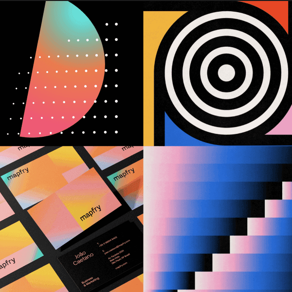

The initial stages of development were based around exploring bold combinations, experimenting with a host of palettes, icons, and textures. It enabled the client to see different routes and approaches and showed them the possibilities of what it meant to be ''disruptors'.


At the heart of the identity lies the disruptor icon. When two are combined with another, it creates a symbol of connection and integration, telling the story of recruiters and candidate working together to fill roles within businesseses. This combination serves as the core message of talent.ai and the primary logo.
To complement the disruptor theme, a vibrant colour palette was created, dominated by bright purple and pink hues and balanced with a dark blue. Strong geometric shapes were incorporated as brand elements, lending a distinctly tech-inspired aesthetic. Photography provided a human element, featuring individuals from the tech businesses spaces which were overlaid with glitch textures. A set of custom icons were developed to enhance consistency across collateral.

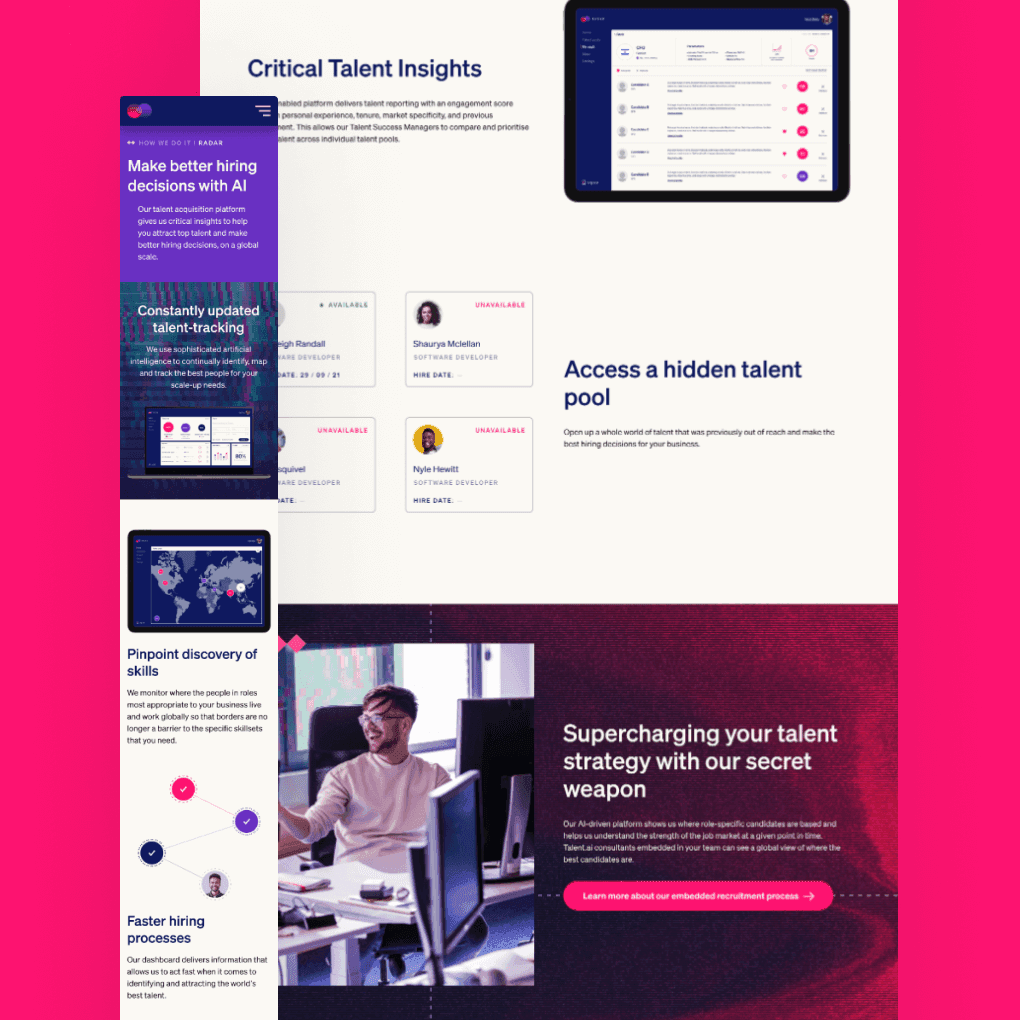
Alongside the identity overhaul was the creation of a new website, one that resonated more deeply with the tech industry. At the heart of the homepage lay an interactive map, allowing visitors to explore the breadth of talent.ai's work through clickable actions. These actions showcased their case studies, active cities, and latest tech news (blog posts), with the intention of seamlessly driving traffic from social channels
Beyond serving as a recruitment platform, the repositioning of the business prompted a shift towards promoting their expertise in tech news and knowledge with the goal to establish talent.ai as an accessible resource for candidates, recruiters, and tech enthusiasts alike.