



Upon delving into the company's history, it became evident that the old branding lacked a cohesive narrative. Created during the company's inception, it served its purpose in establishing a foothold but failed to tell a compelling story. The decision to rebrand presented a golden opportunity to align the new identity with the company's unique journey.
Central to this narrative is the question that always arises: "Why the name?" The answer lies within the company's ethos and inspired by a quote by Einstein:
"I would spend fifty-five minutes defining the problem, and then I would need just five minutes to solve it".
The name encapsulated the company's approach to client work: thorough upfront research that deliver solutions of value to clients.
A unifying theme emerged: Time. Time found itself a part of every aspect of the company's operations and their dedication to efficiency and excellence.

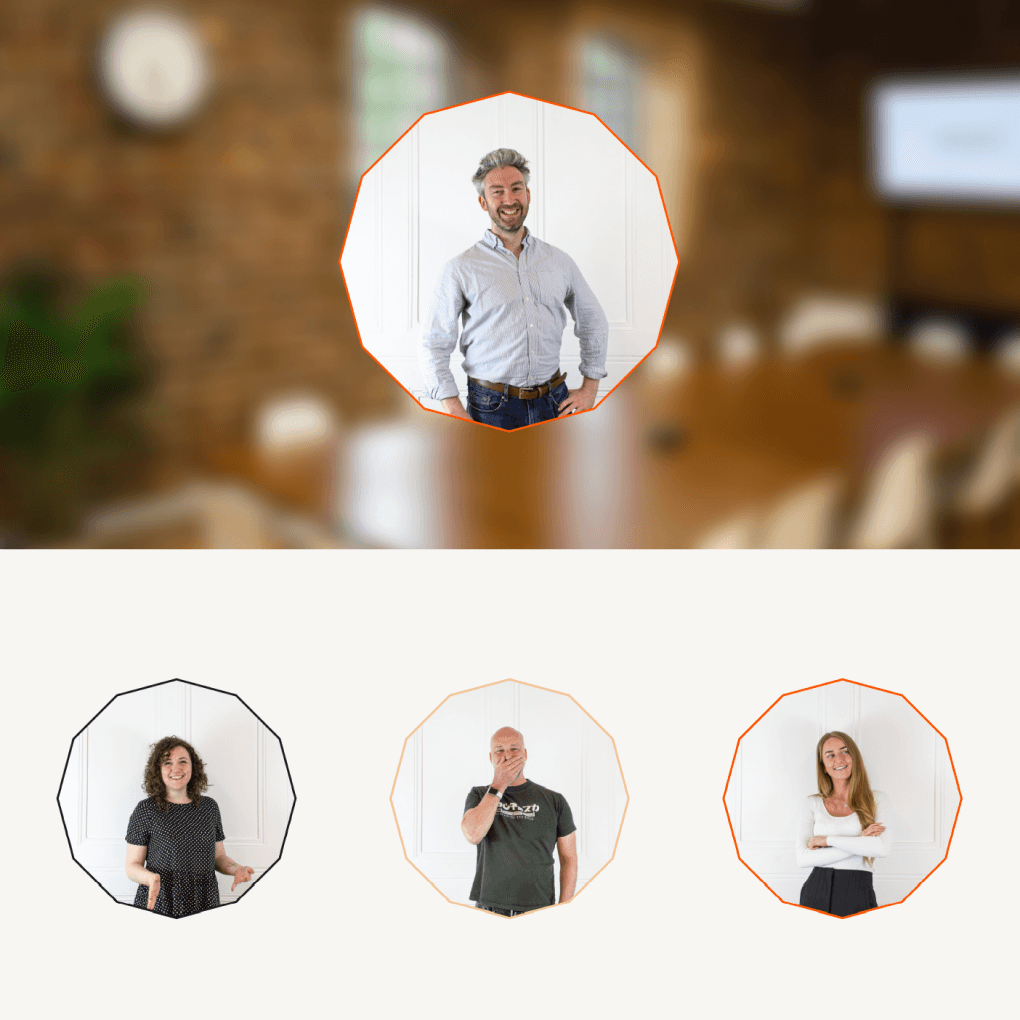


The rebrand centred on a bold new identity inspired by the two parts of the company's name, using this to create a contrasting visual system that paired systemic thinking and creative results.
The word mark was split in two, using a structured sans serif, to represent the thorough strategic process, with a softer serif to counter, that represents the flourish of the outcome.
Leaning into the 'time' element of the business helped devise a visual basis for some of the brand elements, for example, an icon split into a 55:5 ratio and visual motion which echoed the rhythmic ticking of a clock.
Beyond the identity, every brand touchpoint was refined, including documentation, photography, iconography, and social media, creating a cohesive and recognisable brand experience across both digital and physical spaces.

The second phase of the rebrand focused on establishing a digital presence, building in collaboration with the in-house content team to reimagine the website as a vibrant and engaging platform. The goal was to offer visitors an immersive experience, allowing them to delve into the authentic narrative of Fifty Five and Five. By adding bespoke animations and adopting more fluid formats it created digital system that broke free of a rigid and corporate feel.